What is bootstrap frame work and what is 12 column grid system ?
Responsive Design : Significance of 12 column grid system in a bootstrap framework – Well Explained
Today all the information available in digital form through different screens like Desktops, Laptops, Tablets, Mobile screens and even in smart watches. Have you ever thought that how the same webpage / App / information shows accurately according to the screen size?
There is the significance of frame works like foundation / bootstrap based on 12 column grid system. These frame works has many in built classes to manage the responsiveness of each screens/viewports. And also the developers can use the OOB classes or they can create their own classes to manage the responsiveness. Responsiveness means the data which is contained n the webpage will re-arrange automatically according to the screen size (Desktop / Laptop / Tablets / Mobiles). Here we are going to discuss about the bootstrap framework and 12 column grid system.
Lets think about how can we achieve responsiveness?
12 column grid system is made to achieve the perfection of responsiveness in Bootstrap and in Foundation. There are two method to get bootstrap classes in our webpage.
One is we need to download bootstrap package kit and paste to our project folder.
Download link here
then define the path to Bootstrap CSS and JS files into our page
<link href="bootstrap-5.3.0-alpha1/dist/css/bootstrap.min.css" rel="stylesheet"><script src=" bootstrap-5.3.0-alpha1/dist/js/bootstrap.bundle.min.js"></script>Second method is to include supporting script links to our webpage directly from bootstrap's server.
Eg:
<script src="https://cdn.jsdelivr.net/npm/@popperjs/core@2.11.6/dist/umd/popper.min.js" integrity="sha384-oBqDVmMz9ATKxIep9tiCxS/Z9fNfEXiDAYTujMAeBAsjFuCZSmKbSSUnQlmh/jp3" crossorigin="anonymous"></script><script src="https://cdn.jsdelivr.net/npm/bootstrap@5.2.3/dist/js/bootstrap.min.js" integrity="sha384-cuYeSxntonz0PPNlHhBs68uyIAVpIIOZZ5JqeqvYYIcEL727kskC66kF92t6Xl2V" crossorigin="anonymous"></script>Now we are moving to 12 column grid system in the Bootstrap framework
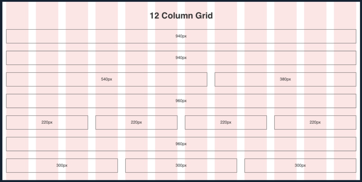
The grid system is based on an invisible 12-column layout, where the page is divided into 12 equal-width columns. This system allows developers to easily create responsive designs that adjust to different screen sizes and devices.
The grid system is based on a set of CSS classes that define how content is displayed at different screen sizes. For example:
"col-md-6" class defines a column that takes up half the width of the screen on medium-sized devices.
While "col-sm-12" the class defines a column that takes up the full width of the screen on small devices.
Developers can use these classes to create complex layouts that adjust to different screen sizes without having to write custom CSS code. The 12-column grid system has become a standard in web development and is widely used in developing responsive web applications.
<div class="row">
<div class="col-lg-4 col-md-4 col-sm-6 col-xs-12" style="background-color:lavender;">
<p>column-1</p>
</div>
<div class="col-lg-4 col-md-4 col-sm-6 col-xs-12" style="background-color:lavenderblush;">
<p>column-2</p>
</div>
<div class="col-lg-4 col-md-4 col-sm-6 col-xs-12" style="background-color:magenta;">
<p>column-3</p>
</div>
</div>
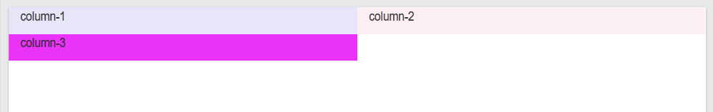
The above code will show in big screens (Desktop & Laptops) as follows:

In Large screens col-lg-4 class divides the row into 3 equal columns
In Medium screens col-md-4 class divides the row into 3 equal columns
And if we resize the screen to 992px or less, the same will show (in tablet) as follows:
In small screens col-sm-6 class divides the row into 6 equal columns and the last column will show to the next row
And again if we resize the screen to below 768px, the same will show (in mobiles) as follows:
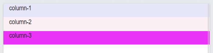
In Extra small screens col-xs-12 class stretches the row into full width columns and each column will display one below one.
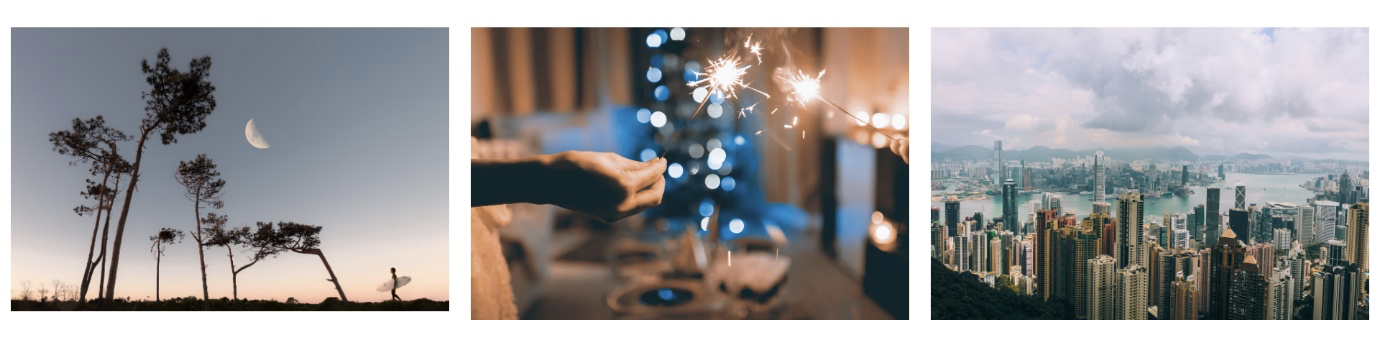
Lets now try to create an responsive simple image gallery
<div class="row pb-3 pt-3">
  <div class="col-lg-4 col-md-4 col-sm-6 col-xs-12 pb-3 pt-3">
    <img src="https://images.pexels.com/photos/1242764/pexels-photo-1242764.jpeg"
    class="img-fluid img-rounded" style="height:auto; width:100%;">
  </div>
  <div class="col-lg-4 col-md-4 col-sm-6 col-xs-12 pb-3 pt-3">
    <img src="https://images.pexels.com/photos/834894/pexels-photo-834894.jpeg"
    class="img-fluid img-rounded" style="height:auto; width:100%;">
    </div>
  <div class="col-lg-4 col-md-4 col-sm-6 col-xs-12 pb-3 pt-3">
    <img src="https://images.pexels.com/photos/599459/pexels-photo-599459.jpeg"
    class="img-fluid img-rounded" style="height:auto; width:100%;">
  </div>
 </div>
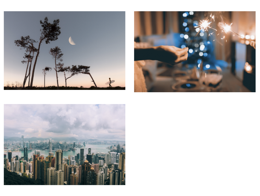
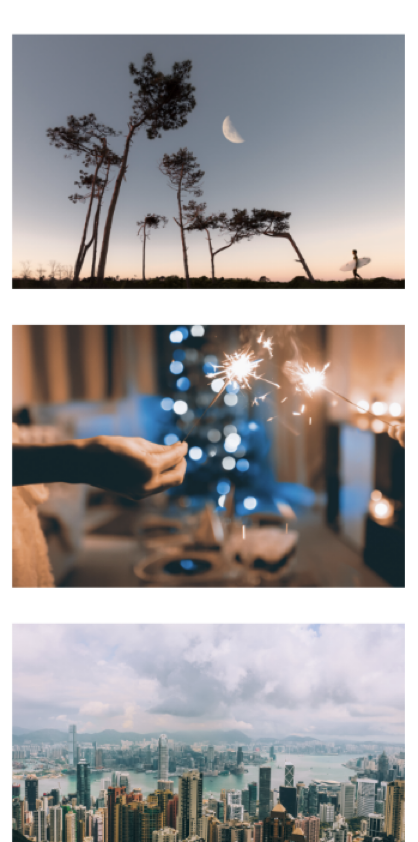
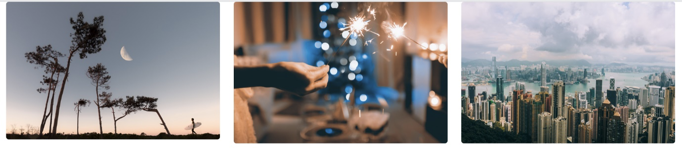
The above code will give us results in different screens like the below images:
Desktop (above 1200px)
Tablet (below 1200px)
Mobile (below 782px)
Consider this line of code
<div class="row pb-3 pt-3">here we use pb-3 pt-3 those are for padding in top and bottom of the row.
pb-3 is a default class of bootstrap for padding-bottom 30px
like wise mb-3 is the class for margin-bottom 30px
pt-5 for padding-top 50px
mt-5 for margin-top 50px
Consider this line of code:
<img src="https://images.pexels.com/photos/1242764/pexels-photo-1242764.jpeg"
class="img-fluid img-rounded" style="height:auto; width:100%;">
Here img-fluid class is inbuilt in bootstrap for adjusting the size of the image according to the screensizes
And image-rounded class will give the rounded corners to the images
Like this: